
"Start with Vision and the rest will follow."
A client came to me with an idea for a logo to rebrand his already successful residential painting company. The founder of Vision LLC is a young and passionate worker with ambition and a rich Bosnian heritage.
We established a concept in our first meeting and his instruction was to expand upon the idea.
The direction was "the word 'vision' where the 'o' is replaced by a golden eye."
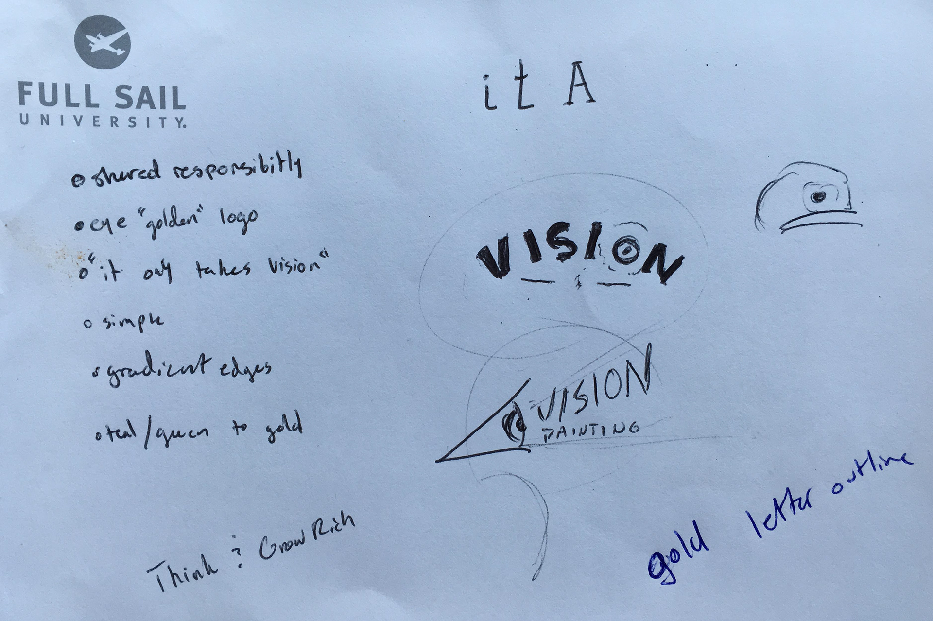
The first notes I took on the job were vague, but the goal was a dynamic and versatile logo that represented the diversity of the services offered by Vision and the commitment to faithfully create the Vision of its clients.
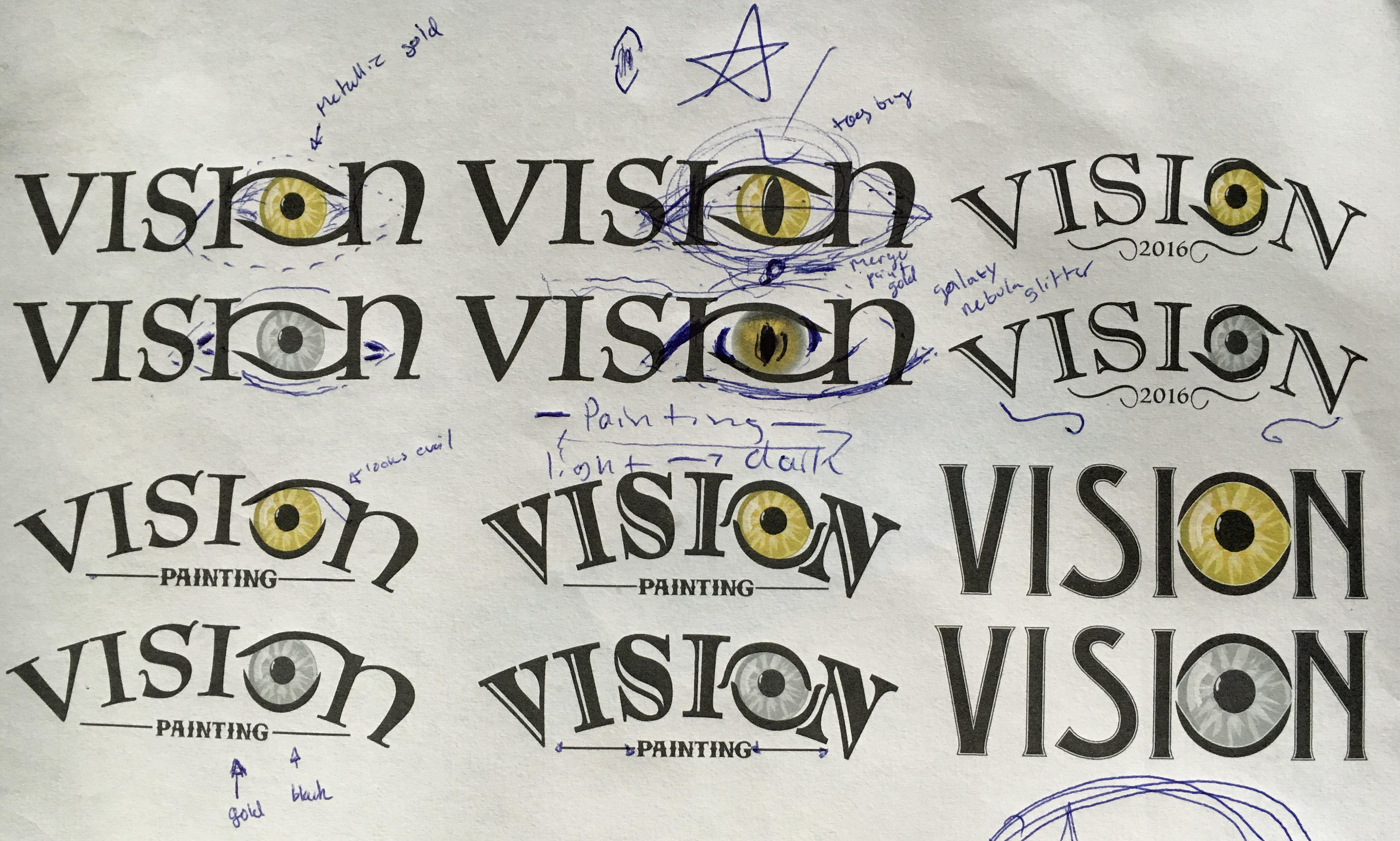
The initial iterations of the logo featured lots of different typefaces to try and identify something that represented the rich history of Vision and the creativity of its owner. I had communicated to the client that his initial desire for a photo-realistic eye would not print faithfully on every possible format (such as embroidery, car wraps, or other marketing materials). I suggested a vector graphic eye that would be scalable, morphable, and easier to work with.
I demonstrated this versatility by preparing a sample animated logo.
We also agreed that the perfectly round pupil looked a bit disturbing and opted for a feline oval pupil.
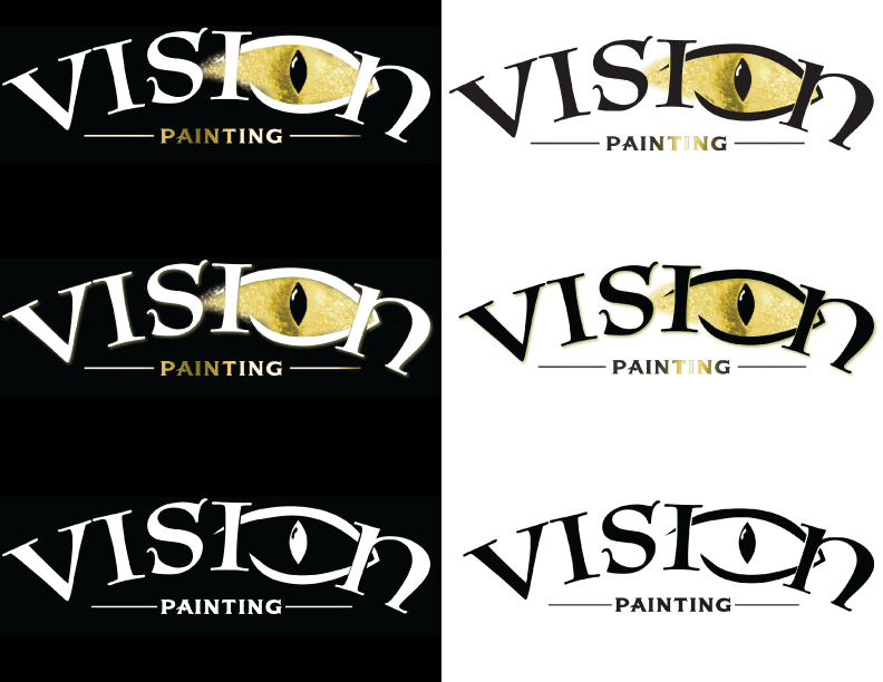
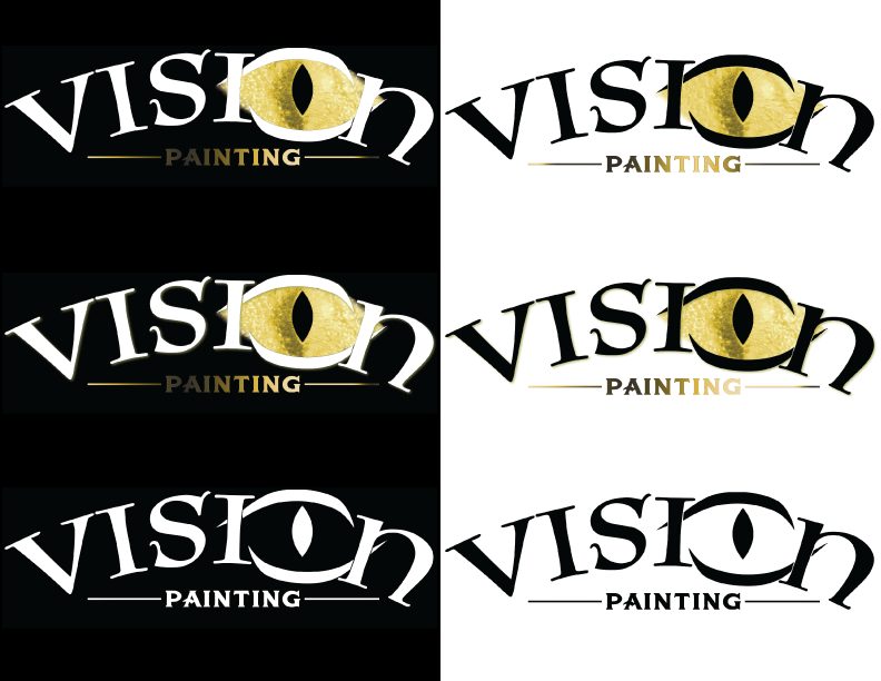
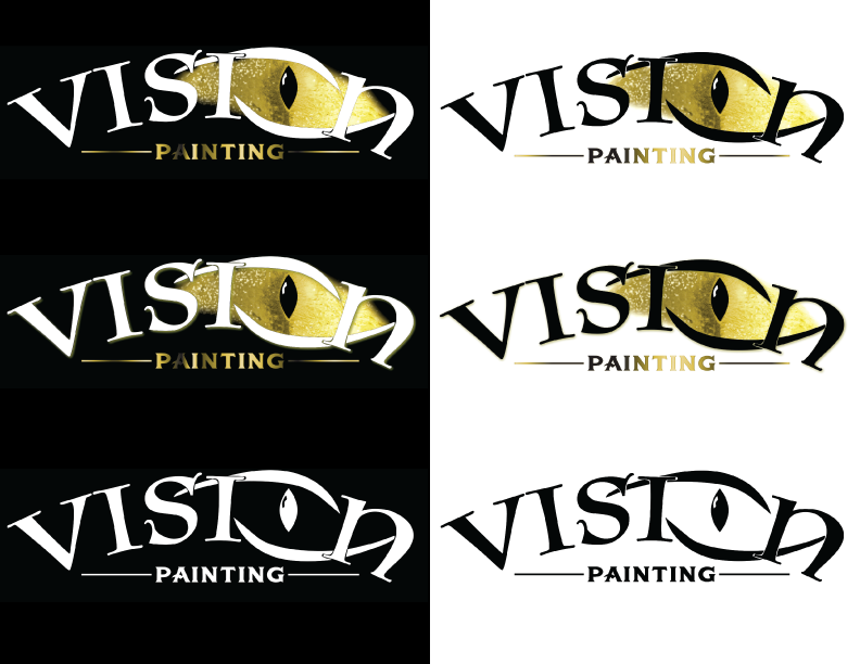
Per the client's request, we stuck with the photorealistic eye, but compromised that the black elements of the logo be isolated so that if a situation arose where the photorealistic eye could not be used, the vector logo could be used instead. I demonstrated that even without the gold iris, the logo could be compelling and unique.
We also narrowed down the typeface selection to a style that communicated the owner's heritage with curvilinear line quality and a subtle rich influence.

The final logo design is smooth and dynamic. It works with or without the iris and when printed will feature a metallic finish the subhead.

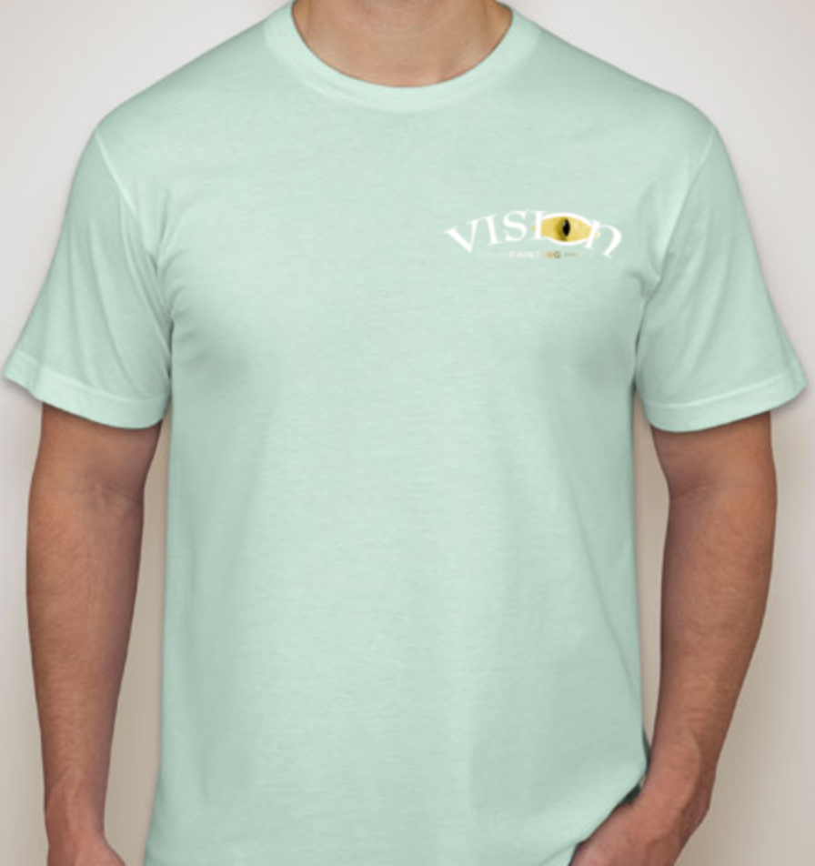
After I finish designing business cards for Vision Painting LLC, the next step will be summer apparel for the owner and employees such as the sample above.