Here are gathered the branding materials and assets for Launchpad Coffee & Cafe. The no-nonsense steampunk-themed cafe offers premium food and beverage for busy commuters who don't have time for the bells and whistles of those Seattle-based coffeehouses.
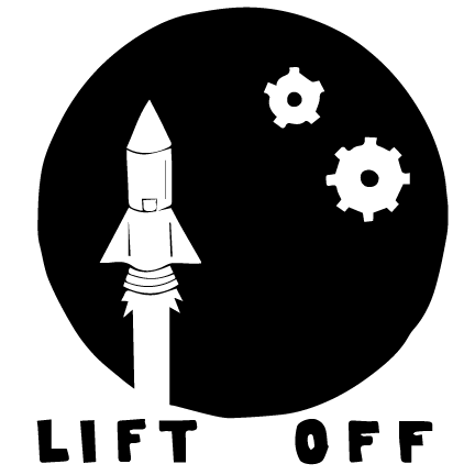
This is the final logo design:
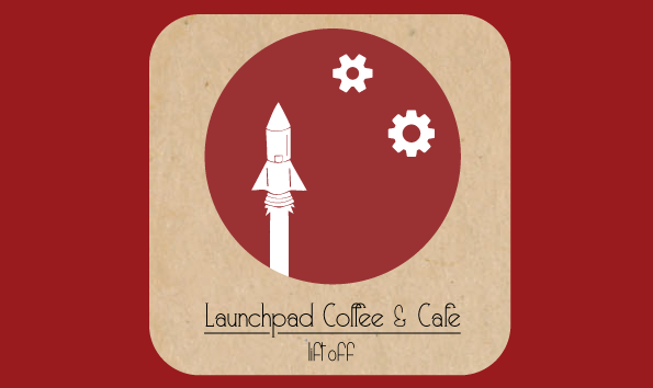
The final logo utilizes both an icon and text that can work together or independent of one another. The symbolic imagery of the rocket and "stars" speaks to the strength of the coffee and the steampunk theme.
Below are samples of the outdoor advertising assets.
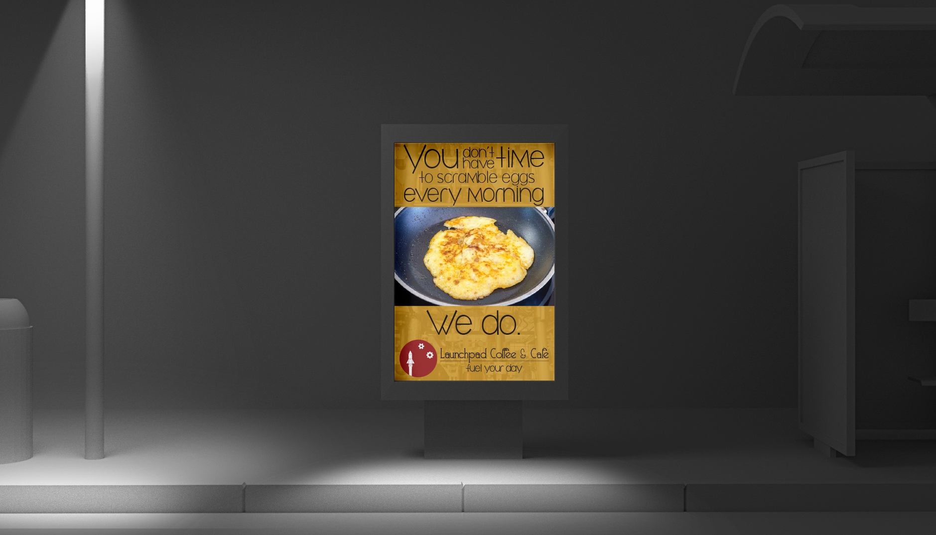
The voice and tone of the advertising campaign is tongue-in-cheek and uses imagery of delicious food paired with humor to appeal to the no-nonsense customer.
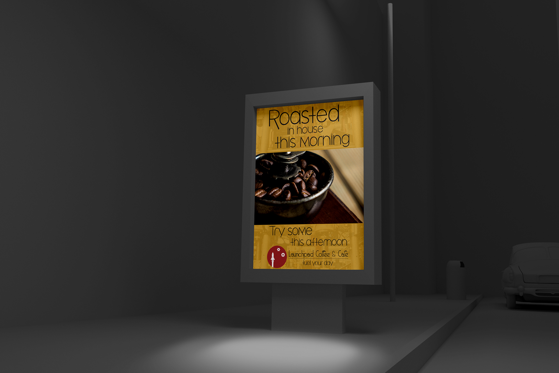
I also wanted to draw attention to the in-house roasted coffee served by Launchpad.

The industrial worn metal texture speaks to the steampunk theme while also playing on the "people are machines that need fuel" message behind the brand. If coffee is your fuel, Launchpad is your coffeehouse.
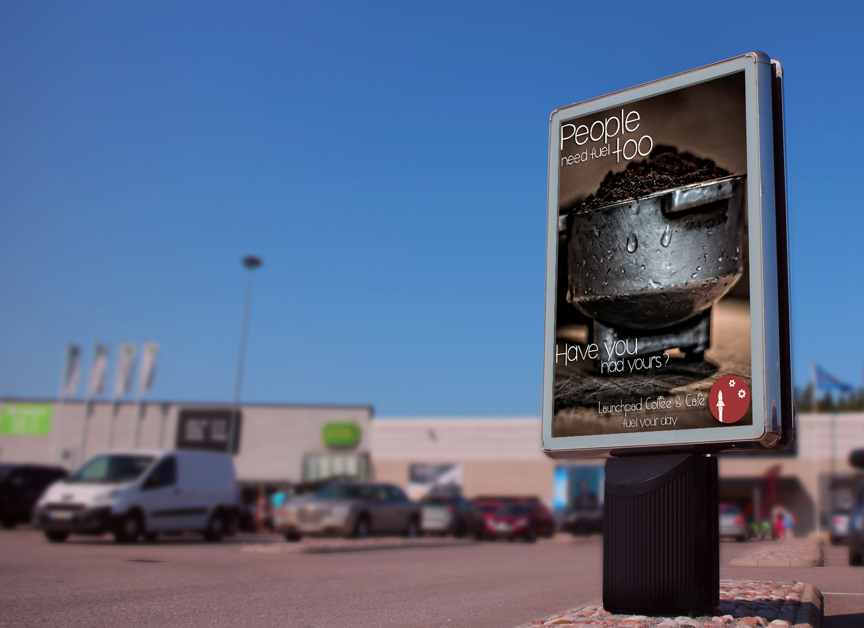
The full-image version of the same advertisement draws more attention to the rustic wooden table and metal brewing scoop.
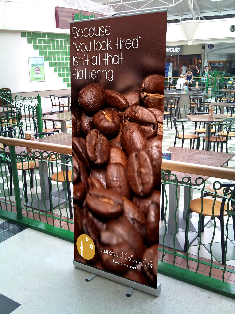
Outdoor advertising in food courts of shopping malls can draw in customers with the promise of instant gratification.
Here are some branding materials mock ups featuring both ideal colors for the logo design.
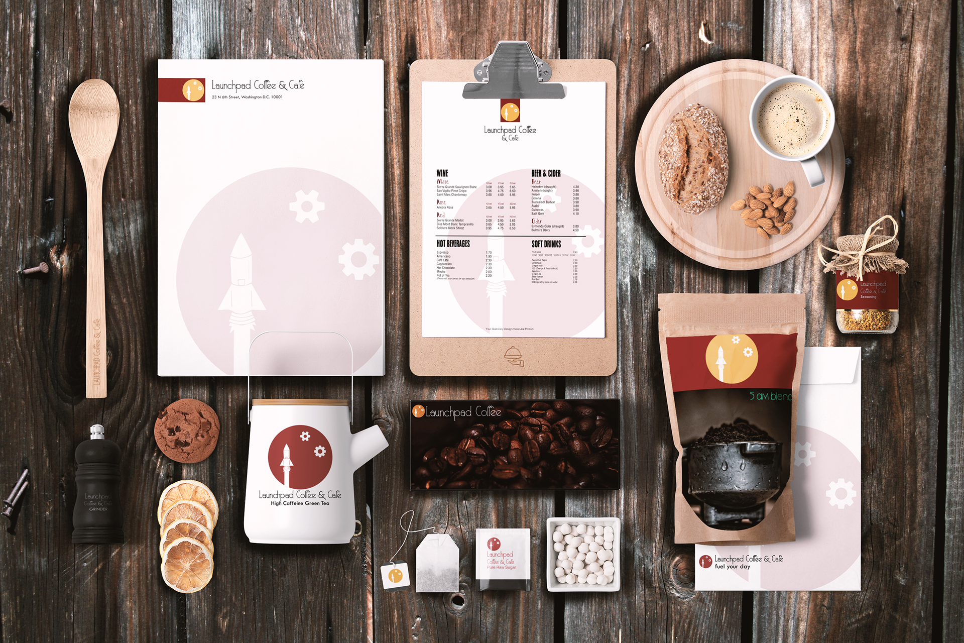
These are some of the sample promo items and branding for merchandise.

Small kitchy gifts will help spread brand awareness and coffee beans to go are a great way expose out-of-town customers to the product so that when they visit the DC-metro area they will surely add Launchpad to their list of stops.
This is a sample of the Rapid Pick-Up app UI.

Large images of the food and short easy-to-read product descriptions make navigating the app a snap. Placing an order in advance makes customers feel like a regular, "give me the usual" patron.
These are the prototypes for a limited promotional item.

This is an early sketch of the limited edition all-in-one coffee-grinder French-press Bottle Rocket! Branding elements all over the rocket will instill the brand's imagery as part of the customer's lifestyle and the convenience of the product makes it a valuable addition to the commuter's arsenal.

This is a prototype created in Photoshop that illustrates how the promo item may work.
Here is a link to the interactive style guide: Launchpad Style Guide
It is a responsive, Bootstrap and PHP based website with strong visuals and easy-to-reference usage guidelines for branding materials and logo treatments.
This is one of the three mood boards. In the end, most of the final design elements came from this board.
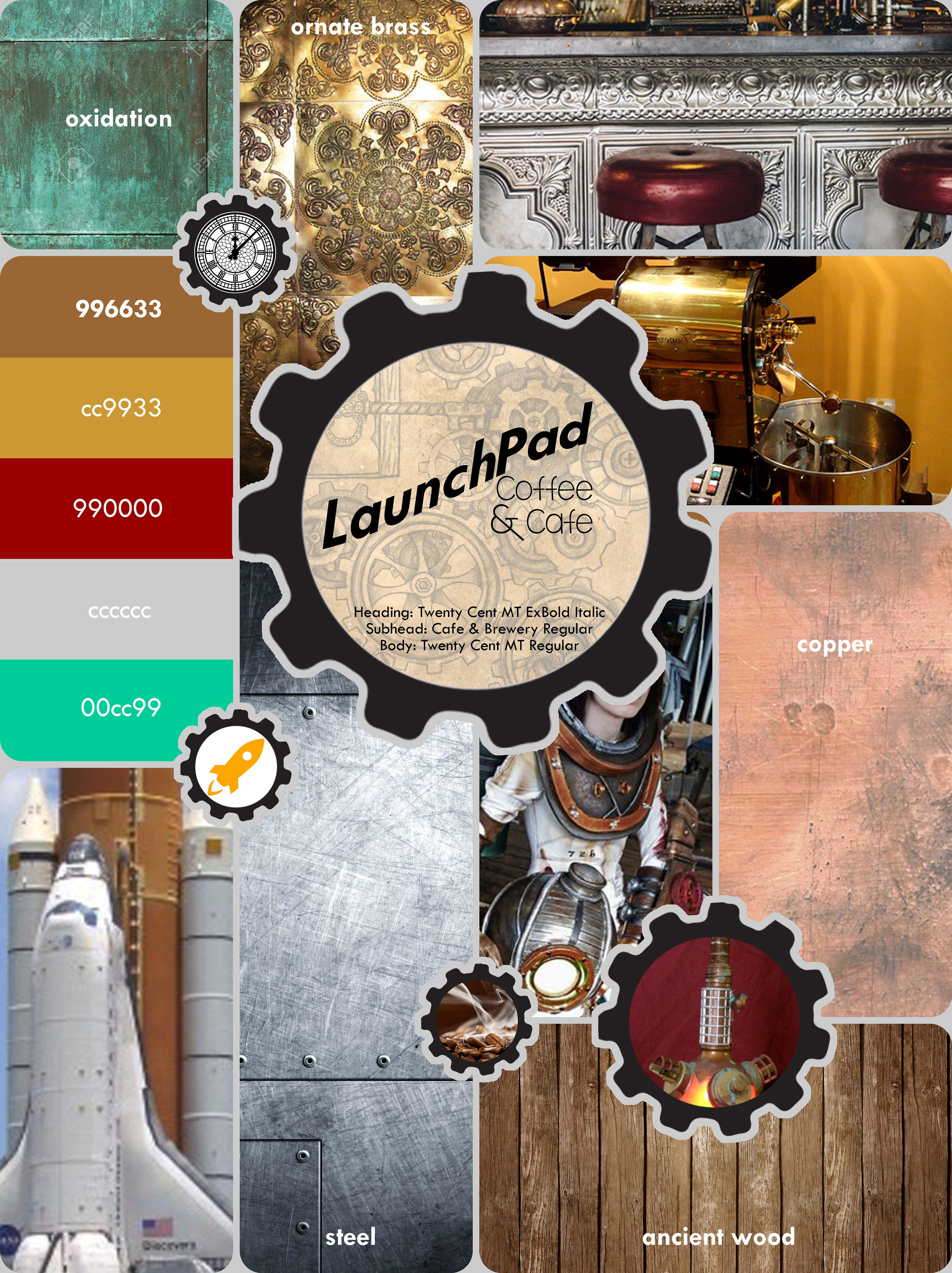
The steampunk aesthetic is featured strongly in the colors and textures of the piece and it serves as a visual representation of style Launchpad wishes to implement.
This is the animated dynamic mood board I prepared from the static mood board above.
Below are several of the unused logo sketches, both hand-drawn and digital.
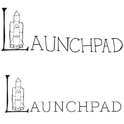
An early logo sketch that literally turned the "L" in the brand name into a rocket launch pad. Visually it was very stimulating and symbolically appealing but the legibility quickly became an issue.
This hand-drawn logo is reflective of the type of illustration prominent in all of the branding materials, but the inconsistency of the circle and awkward gears made it look unprofessional.

This digital mock up of the logo resolved the issues of the hand-drawn version, but sacrificed the personality of the piece. The final logo iteration is a marriage of the hand-drawn rocket and vector elements.