I was tasked with creating a minimal logo for a running blog that is looking to expand and monetize through the use of branded bumper stickers, web promotions, and sponsorships from athletic clothiers. The above are my drafts and below is the final choice from my client.
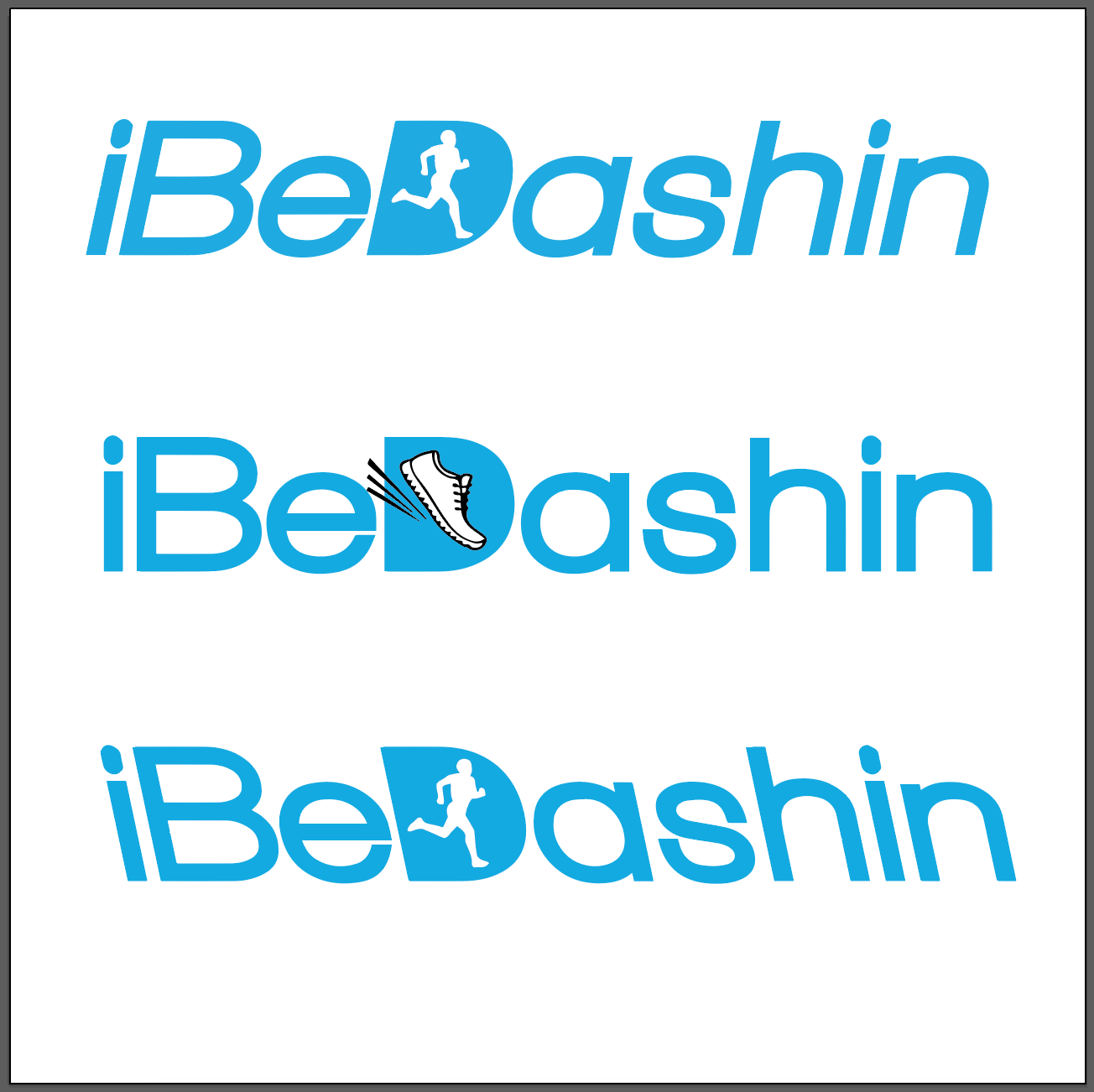
This was the sketch phase of logo development. The oblique lettering styles are more effective because they imply motion, which is thematically appropriate for a running blog, while the regular type in the middle is static. The clean and simple sans serif type is easy to read and works well in print or online. The idea of an isolated letterform or icon was always in play in order to affirm the blog was about running and not fashion or something else, so a sneaker or a running man was considered, but ultimately the runner was chosen for specificity. The running shoe could still be construed as an apparel company.
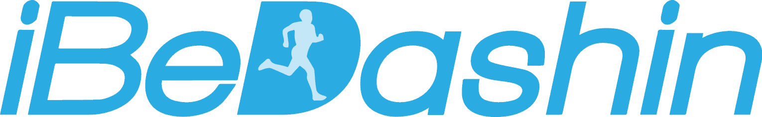
The final logo chosen by the client features the forward slant and running man silhouette. It is modern and simple with a calming hue and sense of motion.