Part of my job as a web designer is frequently revisiting old work and implementing the latest techniques to achieve the best looking product.
For hip-hop artist Aspect, this meant a massive overhaul to the old PHP-based website I designed back in 2014 and incorporating visual effects such as parallax scrolling, a responsive mobile-friendly site, full access to his entire music catalogue, and drafting a logo that can be used to brand future releases and merchandise.
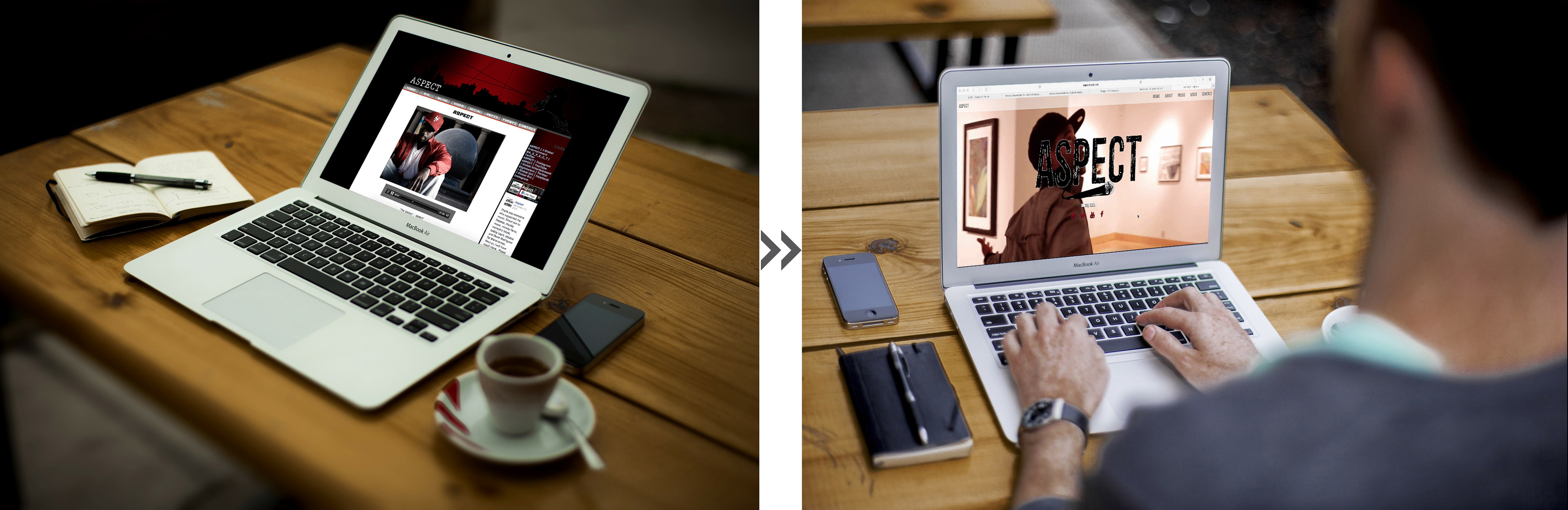
The old website was formatted for Wordpress compatibility, so I tried to keep everything tidy and kept a sidebar for links and social media widgets. As of 2015 however, Google prioritizes mobile-friendly responsive websites over old-fashioned desktop-optimized versions. I took this opportunity to harness Bootstrap CSS styles and enhanced visual effects such as parallax scrolling and a compressed video background to make the site pop while making it easy to navigate on even the smallest mobile device.
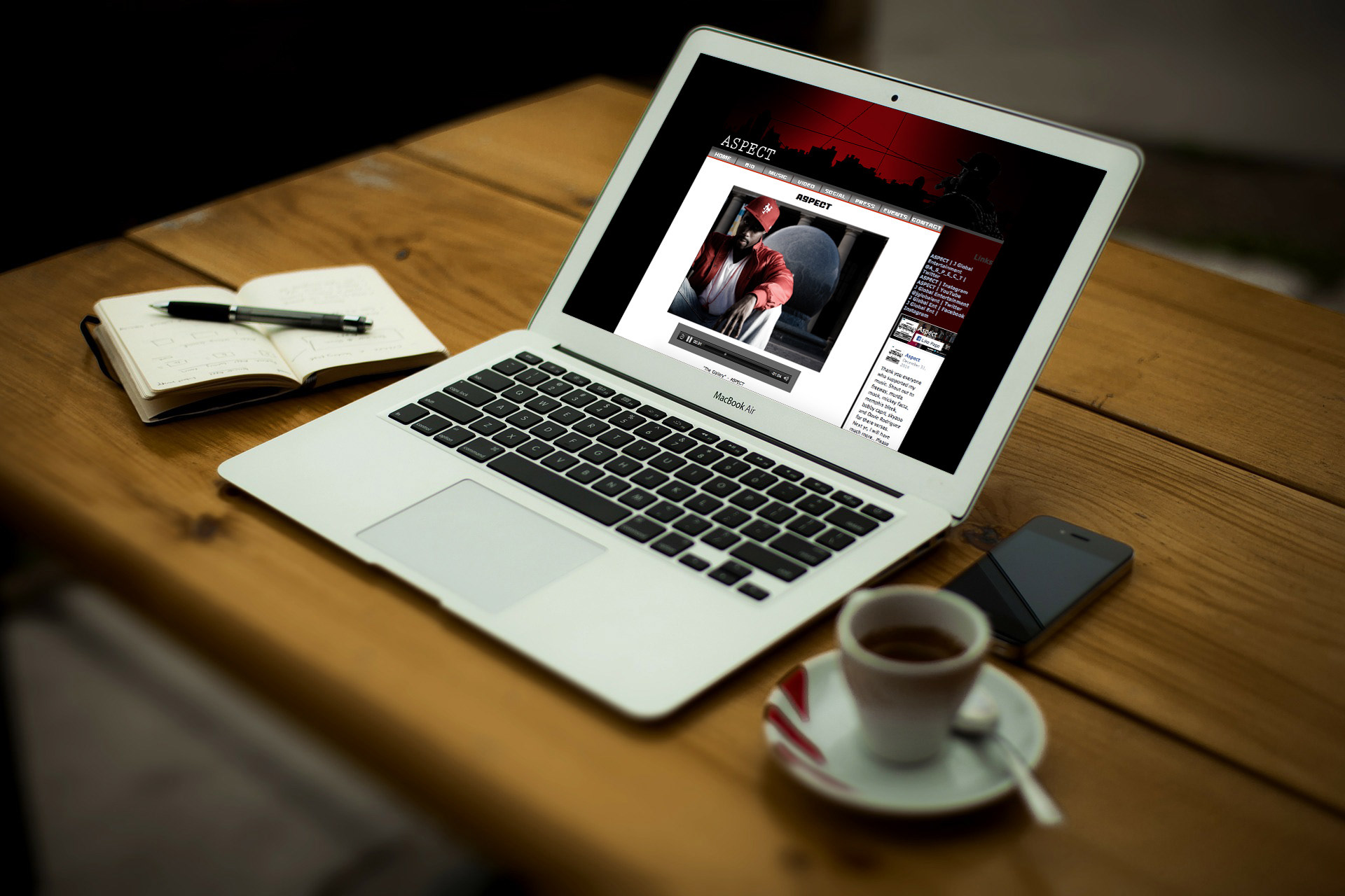
You can clearly tell where the "content" div as well as "header.php" and "sidebar.php" sections of this homepage are. The navbar was tied to the menus feature of Wordpress to enable easy page adding, but that was the most dynamic element of the whole site.

The new version is full-screen, taking advantage of all the real estate we can which is good for desktop viewing and great for mobile. The navbar is simpler and the whole website is contained on one page with anchor points, rather than having to load new pages with each click. It also features social media icons rather than text links that are old-fashioned.
Old site:
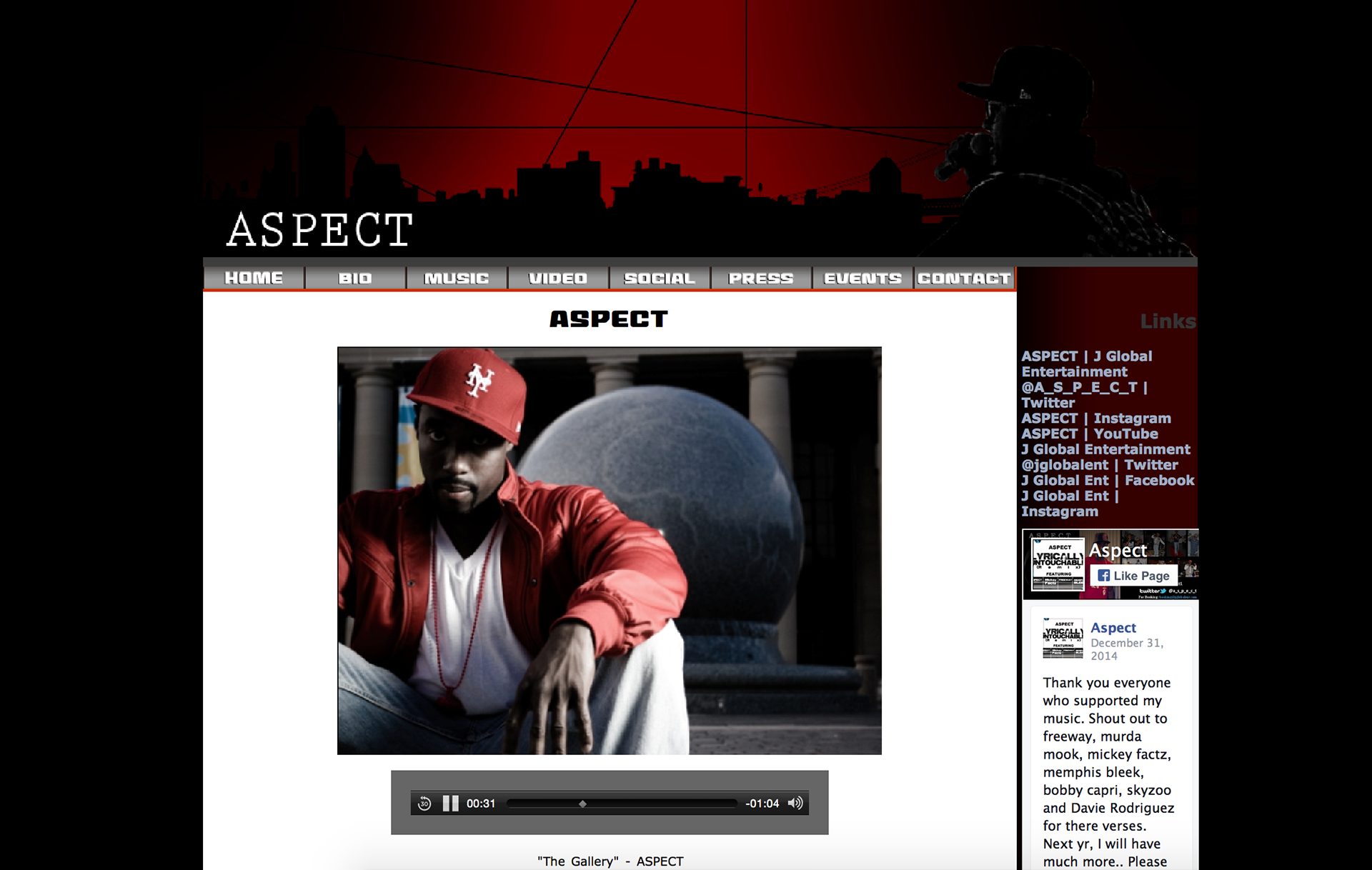
The old website was dark and very urban inspired to reflect the artist's Queens upbringing, but this conflicted with his desire to penetrate new markets and introduce new audiences to classic hip-hop.
New site:
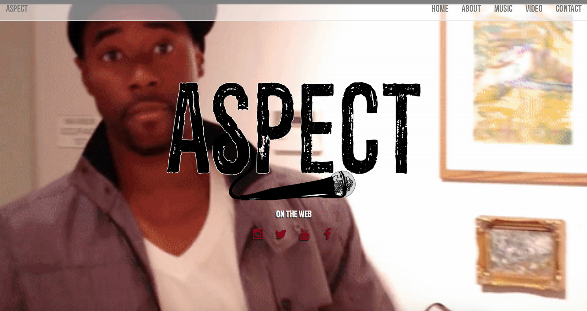
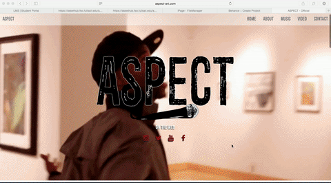
The new site is bright, with a predominantly yellow color palette. Yellow carries conotations of happiness and courage in most western cultures and royalty in Asian cultures. It is popular among fast food chains for its ability to grab viewers' attention.
Logo development:
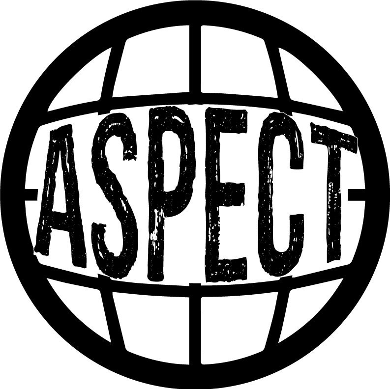
Early logo ideas were intended to reflect the artist's "global" appeal. Ultimately this design was too similar to Captain Planet and did not address hip-hop in any way.
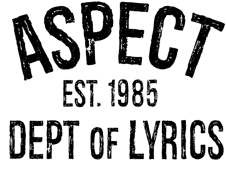
Other iterations attempted to capitalize on the artist's "athleisure" fashion statements. Again, it failed because it narrows the appeal of his music.
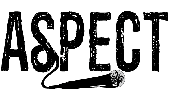
The most successful iteration of the logo was a distressed type treatment and microphone. It is gritty and urban while also linking the idea of lyricism and works on a variety of colors and backgrounds.

Another failed iteration was too urban for the artist's appeal.